The Color: Cobalt
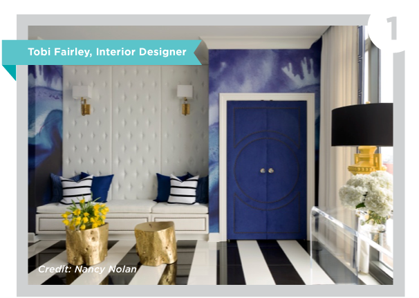
Why it's trending: Blue is still America's favorite color, and I think cobalt takes that color to a whole new level with more energy and intensity. I love this color because it's approachable but risky. In other words, it seems daring, but is still in the blue family, which for most people is ultimately a pretty safe choice.
What it does to a space: It adds energy. It can be perceived as exotic or traditional, depending on where and how you use it. It's such a deep color with a lot of dimension and interest. Mix it with fuchsia and it's daring and fun; layer it in with shades of white and it's classic and timeless. That's the great thing about cobalt: it's classic and trendy all at the same time.
How to use it: I love this color in fabrics, like on a wing chair or some big gorgeous pillows in an otherwise neutral space. It's also gorgeous in glass, whether that's a ceramic lamp base or in accessories. And don't be afraid to use it on the walls!
What works well with it: I love black, white, and grey with cobalt. But I also like to use it with its complementary colors on the color wheel, such as colors in the red-orange family, like orange or pale coral or even moving over to yellow. Honestly, there's hardly a color that doesn't shine when paired with this regal hue!
The Color: Coral
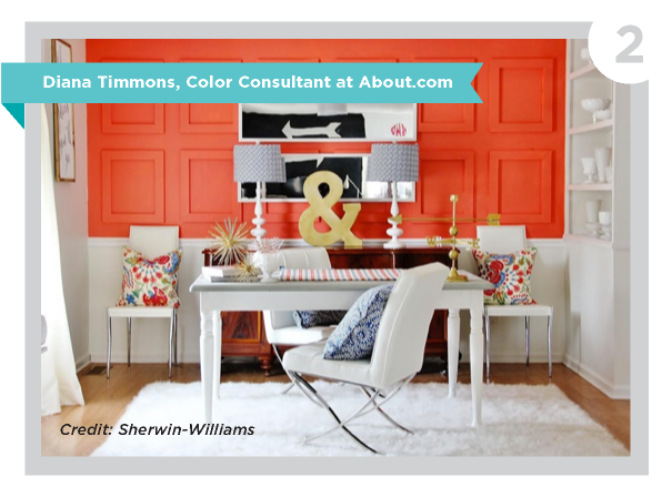
Why it's trending: This is a happy and bright color that also happens to be quite natural. The secret to the perfect coral is to find a shade that has a tiny hint of pink, like the inside of a seashell. Coral isn't necessarily orange or pink; it's just the perfect marriage of the two.
How to use it: Coral is a versatile and warm color that works with a variety of styles, and is one of the few brights that works well with gray and navy blue. Try upholstered accent furniture, throw pillows and painted accent tables as stylish ways to incorporate coral into a space.
What to avoid: Coral is a bright color, so you'll want to use it in moderation. A fabulous coral chair, with a few small coral accents, could be all you need to completely make over your living room.
Carrying it over to other seasons: The awesome thing about coral is that its warmth and radiance makes it easy to assimilate into fall decor. Fall colors are traditionally warm, with lots of orange and brown. Your coral accents will feel right at home with fall decor, especially if you add warm gold metallic accents.
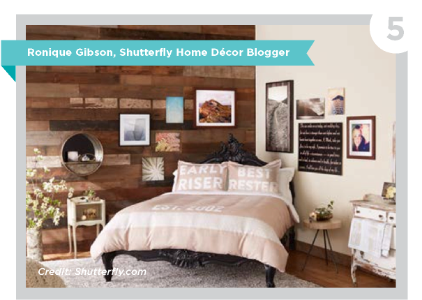
The Color: Blush
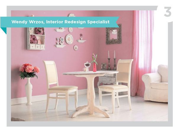
Why it's trending: Design often follows fashion, and soft, romantic neutrals were on every runway last year; they were dubbed "ballet" colors, and pale pink quickly became the unexpected color of the moment.
How to use it: It would be perfect on the walls of a bathroom, with gray stone accents, or a feature wall surrounding a fireplace. Or, if you are brave, a gorgeous, vintage sofa.
What to avoid: I would not use it with other primary pastel colors, like pale green and blue. This can go into cute territory very quickly. Unless you are decorating a child's room, that isn't the direction you should go in.
Carrying it over to other seasons: In fall, it can be paired with a rich brown and cream. In winter, a touch of pale pink will add a cozy warmth to a room, or be an unexpected addition to the more saturated colors.
The Color: Navy
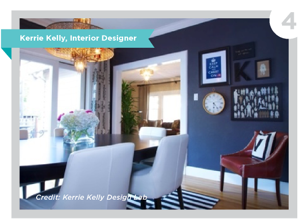
Why it's trending: At my design firm, we truly feel navy blue is the color of the decade. As we traveled to Milan and other areas of Europe over the past two years, we saw high-contrast abound. While the United States might not be ready for the commitment of an interior full of black and white, we feel navy blue is the transitioning shade that will ultimately get us there.
How to use it: I would always recommend pairing navy blue with some element of contrast for the best effect, such as white countertops with blue cabinets, navy walls with white trim. This type of pairing is when navy blue is at its best.
How to carry it over to other seasons: Navy blue is a classic. Pair it with citrus tones or a saturated magenta for a fresh summer look both indoors and out. Contrast navy with white and add in metallic lighting and hardware and you suddenly have created a look of sophistication and timelessness.
What works well with it: Citrus tones, magenta, white and metallics all do well with this classic shade. Think of it as a neutral, just like a pair of jeans or a navy blue blazer. We also love to see this color applied via materials like seagrass wall coverings, nubby throw blankets and velvety fabrics for added texture and interest.
The Color: Mushroom
Why it's trending: For so many years, the design world viewed white, black and gray as the three neutrals to pair with. As lifestyles have become more casual and the idea of using organic textures and colors took hold, so did the realization that neutral colors don't have to be so stark. Mushroom helps show off rich colors in homes yet it doesn't compete with other neutrals beside it.
How to use it: I love seeing mushroom in textile patterns, window treatments, area rugs, and home decor. It lends itself well to rustic homes that incorporate wood, metals, and plenty of organic textures. On the other hand it looks equally as stunning in a penthouse high-rise apartment with Regency-style mirrored furniture and ornate decor.
What to avoid: The largest factor to consider is how much light is coming into your room and how light or dark a hue of mushroom to use. A "don't" would be to use too deep of the color in a dimly lit room, making the space feel more like a cave. My rule of thumb: The larger the windows and sources of natural light there are, the darker the color can be painted on the walls.
What it works well with: Since it is a neutral, it tends to fade into the background, so if you want to add drama to a room with an accent wall it pairs nicely with a rich cranberry red in a dining room, or a hunter green foyer wall.
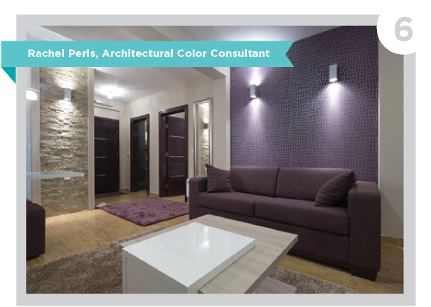
The Color: Aubergine
Why it's trending: I love aubergine because it's funky enough that it hasn't been over-used in a trendy way. It's a color with staying power and versatility. It's a deep purpley eggplant color, but can range from a bright, almost fuchsia hue all the way to a more subdued tone that verges on warm brown.
How to use it: The sky is the limit; it just depends upon how much of it you want surrounding you! I've done dining room walls painted in aubergine, paired with rich oriental rugs and dark wood. I've also used it more sparingly as touches in rugs, upholstery and throw pillows.
What to avoid: People might feel a bit intimidated to use such a strong, dark color, but I like to reassure them, there are no "rules" for how this color works. Tiny powder rooms are great places for deep, rich colors—as I tell clients all the time, this space will never feel bright and airy and open. Add a sparkly chandelier to get some light bouncing around, and it's just elegant.
What works well with it: If the color aubergine was affiliated with a texture, I would say it's a soft feeling you'd like to rub your cheek against, like velvet or silk. So I can see pairing it with contrasting textures like metal, wood or nubby fabrics.
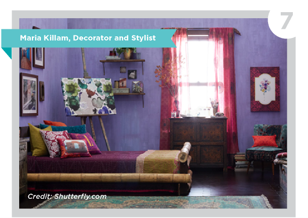
The Color: Raspberry
Why it's trending: Raspberry is an intensely theatrical color that radiates with high energy, exerting a youthful and sensual force. Using this color makes a bold statement that can't be ignored.
How to use it: Most people will use raspberry as an accent color in a living room like I did, but then you could paint the walls in your dining room or powder room raspberry, for example, to create flow.
What works well with it: Sunflower yellows, bright blues and kelly greens are wonderful with raspberry as well as black, white and grey.
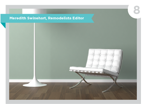
The Color: Pale Jade
Why it's trending: Green is a perennially popular color, but I think the popularity of pale jade can be attributed to people's current interest in achieving a sense of calm at home, and in referring to the simpler days of the past in their decor. Pale jade is a soothing, calm green that has a chalkiness suggestive of history.
How to use it: Pale jade is an excellent choice for walls; it's not bold and doesn't announce itself, but is sophisticated, chalky, and serene. For largely neutral homes, pale jade is a good way to ease into color because it shines next to white and both light and dark woods. My favorite approach is the way we're seeing architects use the color, as built-in cabinets (in the kitchen and elsewhere) in an otherwise white or neutral room. It's a very high-end look.
Accessorize it: For accessories, I love pale jade included in an arrangement of myriad greens: think houseplants, artwork, and vases lovingly styled together.
What works well with it: My favorite color combination for pale jade is with other greens. It's an ideal hue for a nature lover, and makes a beautiful backdrop for houseplants of many shades. For the color lover seeking a peaceful vibe at home—say, for a bedroom—pale jade and blue are a perfect match. The combination is an ideal compromise between traditionally "masculine" and "feminine" styles of decor.
